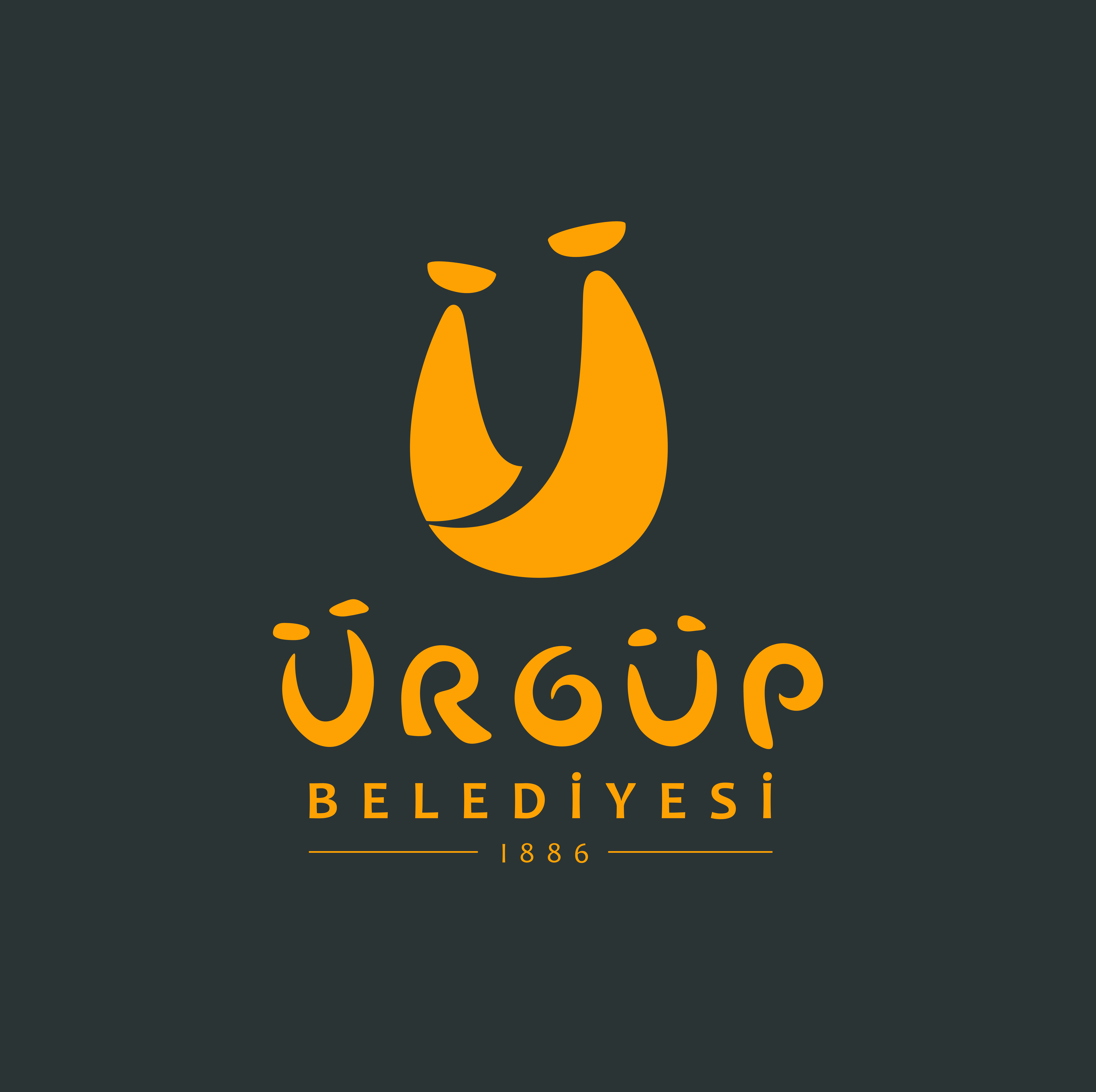
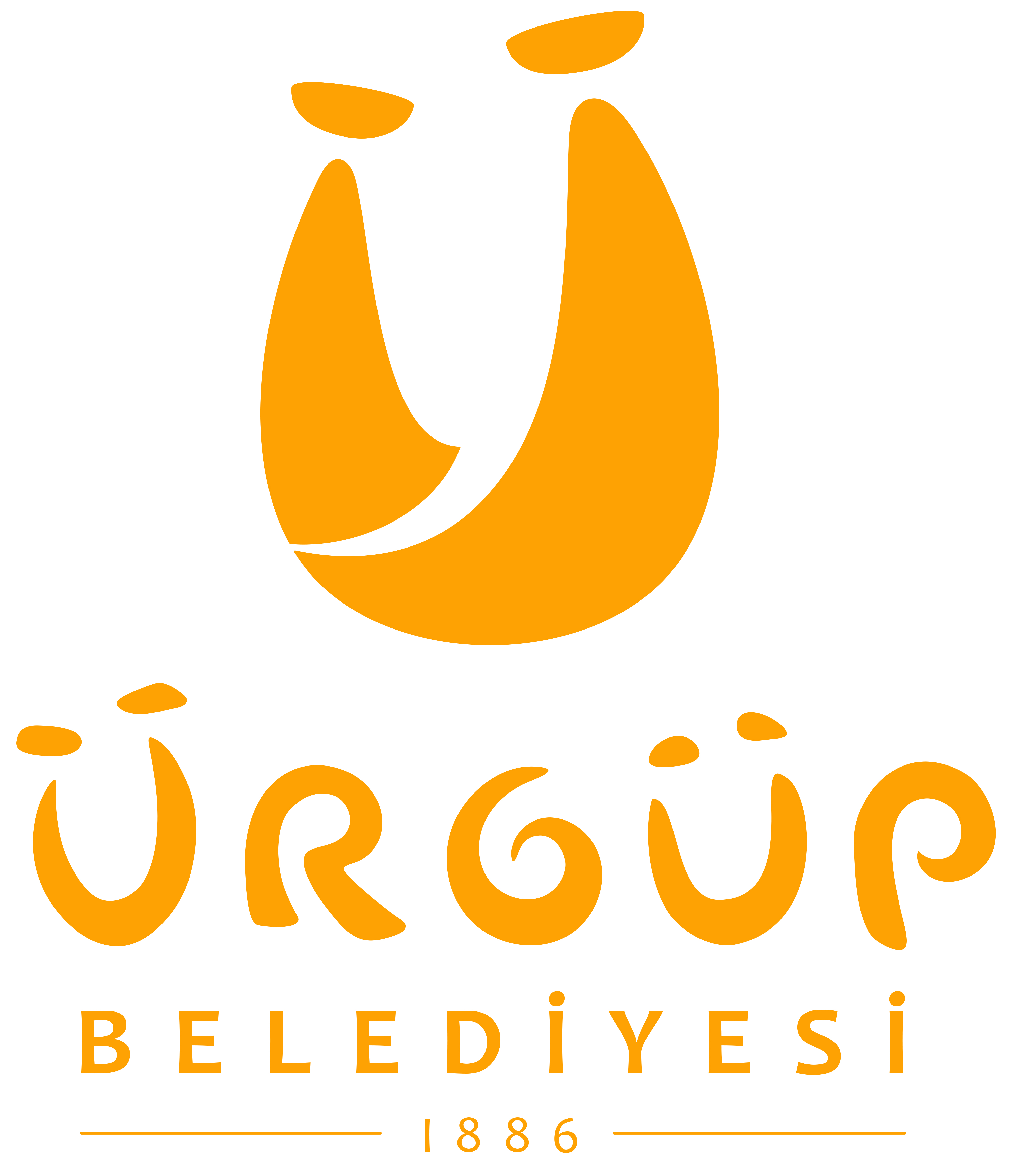
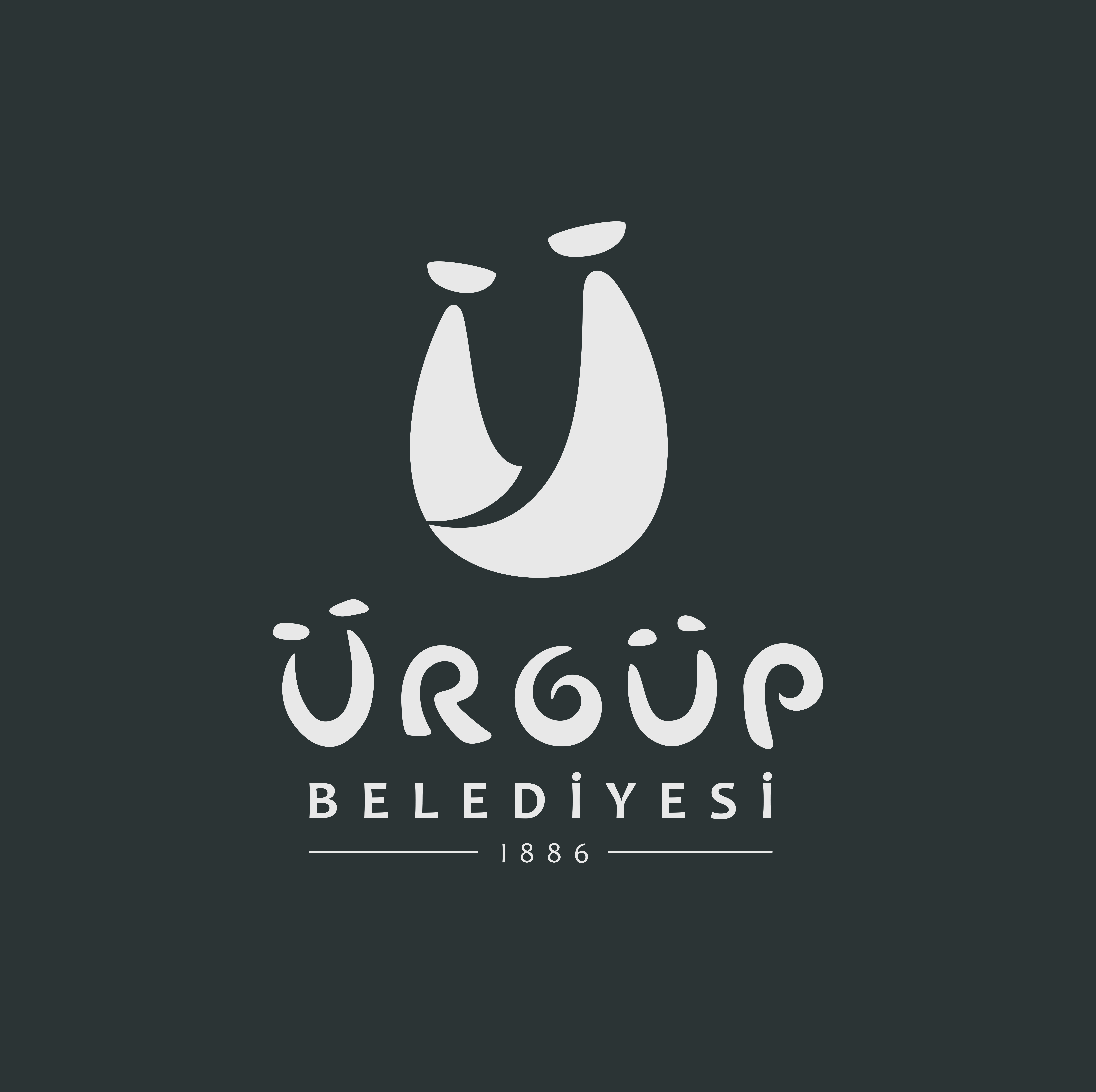
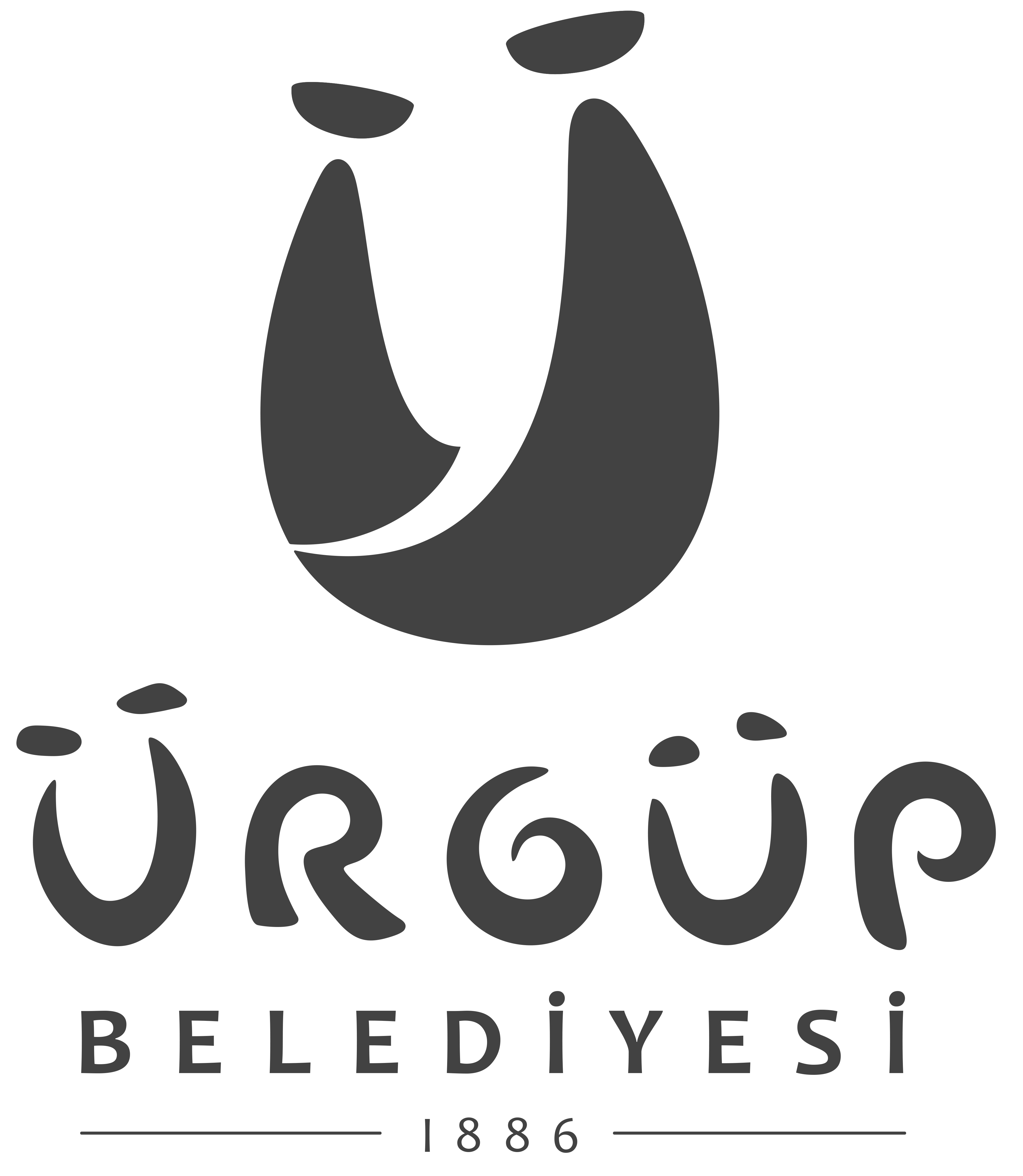
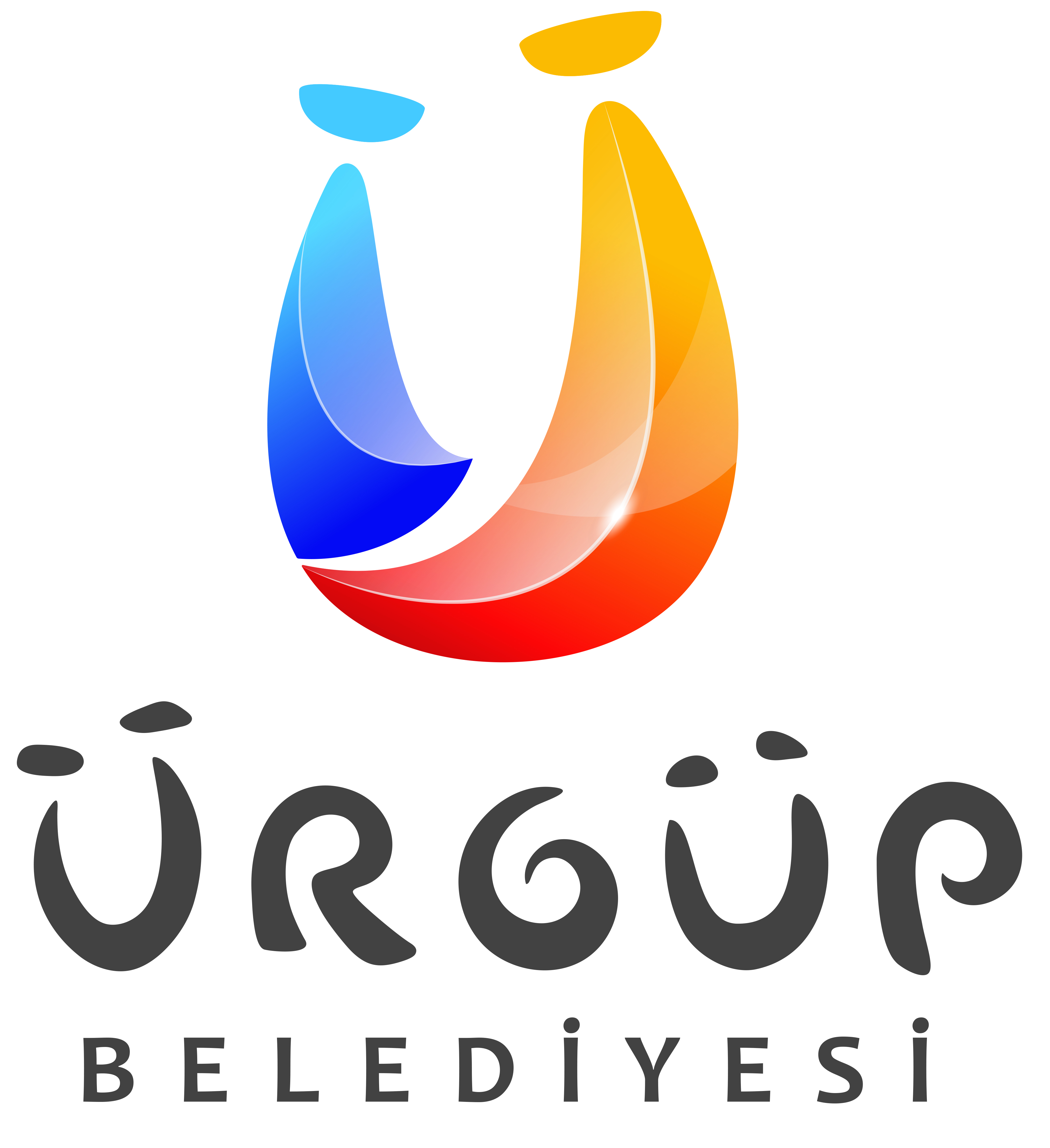
The first impression of the logo is designed with the form of "Üç Güzeller" (Three Beauties).
A road is observed between two aesthetic forms, serving as an invitation to Ürgüp.
It also takes the shape of the letter "Ü," representing Ürgüp.
The relationship between these two forms symbolizes friendliness and tolerance, as they lean toward each other.
The colors consist of three primary colors (red, blue, yellow) and their gradients.
The three primary colors signify the cradle of civilizations, conveying a cosmopolitan meaning.
The gradient of the colors represents communal living.
At the same time, it symbolizes hot air balloons. When viewed upside down, it resembles a paraglider.
Scientifically, the logo is designed based on the golden ratio (phi), and the font used also adheres to golden ratio proportions.
A gradient form has been adopted, expressing the common ground between the past and the future.
It has won first place in numerous competitions, most recently the TÜBİTAK design award, and was designed by Erciyes University faculty member Zafer Türkmen and his team.
A unique font has been crafted specifically for our municipality.
It encompasses meanings such as fairy chimneys, acrobatic roads, a smiling face, a cycle within itself, and the desire to return again.
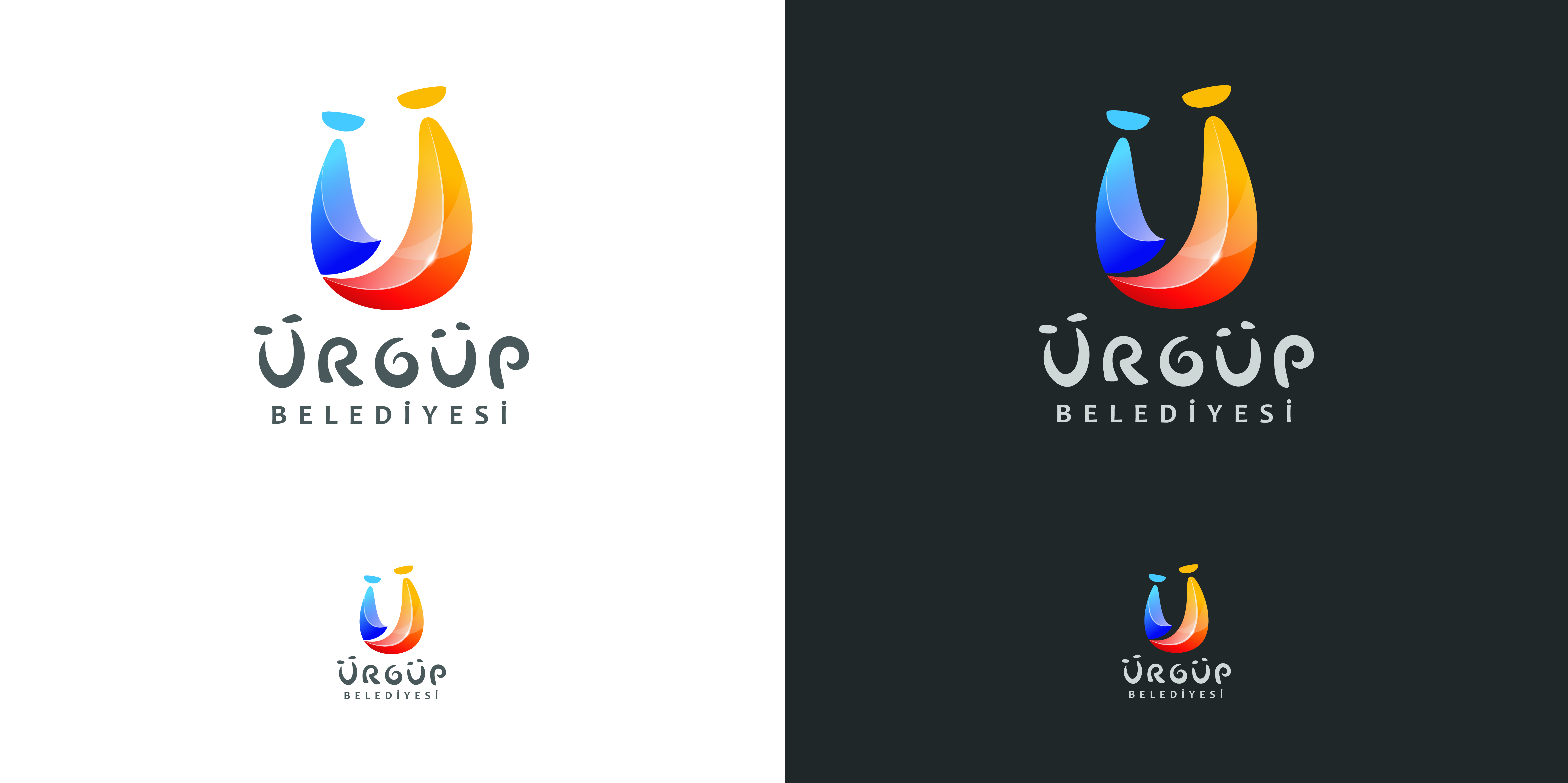
It maintains the same quality across various alternative backgrounds.
The overall perception of the logo carries the essence of a fairytale land.
Its colorful and dynamic text also expresses the meaning of "Ürgüp, the City of Festivals."
In the corporate identity, both its smallest and largest versions retain the same impact.